What makes a website your favorite? Why do you visit it on a regular basis? Perhaps you’ve never thought about these web design and development issues before, so my apologies if I put you on the spot! I’ll give you until the end of this paragraph to think about your response…
One of the reasons you may have given for patronizing a particular website is that “it has great content” (or words to that effect). Or that it provides a service you want or need. And it’s true that great content and customer service are key components to any website’s popularity.
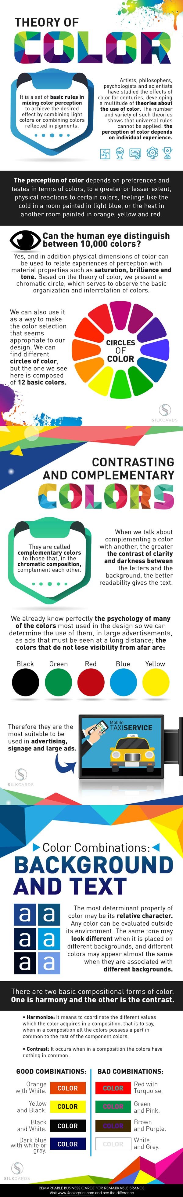
Then again, a fair number of websites offer great content and great service and you’re not visiting them. So again we come back to this question: what attracts people to certain websites? Here is a fantastic infographic (which you can see at the end of this article) that points to one probable cause for a site’s success: having a good grasp of color theory.
In essence, color theory is a set of guidelines to mixing and combining colors in order to create a particular effect for the viewer. For instance, a person standing in a light blue room may feel colder while a person in a red or orange room may feel hotter regardless of what the actual temperature may be. The same is true in the case of websites, where warm colors may convey passion or energy from the viewer and cool colors may connote a sense of calm professionalism.
Of course, it’s important to keep in mind that it’s called “color theory” and not “color fact.” Color theory can be very subjective and no two people are likely to react to a color in the exact way. With that said, a solid understanding of color theory can give you better insight into how a site makes you feel a particular way and why.
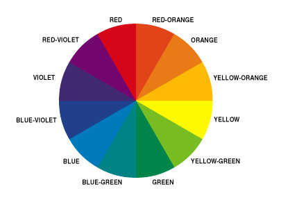
The “Theory of Color” infographic begins with a primer on color theory and how it’s been studied by scientists and utilized by artists over the centuries. One of the key concepts explored by the infographic is that the human eye can make fine distinctions between colors when they either complement or contrast one another. This concept informed the creation of a color contrast wheel.
It probably goes without saying that the goal of most websites (not to mention ads) is to be easily identifiable even from a distance. To achieve that goal, designers typically stick with these easy-to-see colors: black, green, red, blue and yellow. Color combinations on a web page between background and text should harmonize with one another in a manner that’s pleasant to look at.
In thinking about effective color contrasting, here are a few tricks of the trade that Networtech web designers use on a regular basis:
- Choose directly oppositional colors (e.g., black and white) to make text easier to read
- Make the text brighter than the background so that it “pops” from the website
- Avoid using similar colors (e.g., red and orange) for the text and background, as it’ll make it harder for site visitors to read
- Also consider avoid complementary colors (e.g., red and yellow) that don’t offer enough of a visual contrast between text and background
If you’re looking to learn more on color theory and how web designers use it to influence online users, we encourage you to check out this infographic: