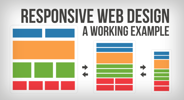
 So, all this hubbub regarding responsive web design has got you asking the question – what on earth is responsive design? Great question. It’s a question that I believe every web designer alive and breathing has most probably had to answer at least once since the design concept came into existence in 2010. I’ll do the same here, and hopefully with enough facility that you’ll grok the concept in less time than it has taken to write this article right up to this point. Responsive web design is a web design technique used to craft websites that display optimally across a wide range of devices. Need me to elaborate? Sure thing. So, basically, the size of the monitor on your laptop is different than the size of your iPhone screen, right? Right. You can browse a given website with either your laptop or your cellular device, but because the two devices have different screen/monitor sizes, how would that website be displayed differently on each device? Obviously, the text and the layout would vary depending on the device you are using to browse with. On the cellular device, the content and layout on display will have to be smaller than on the laptop. But often times, and this was generally the case up until the inception and recognition of responsive web design, a web developer creates a website with the intent that it will be viewed and accessed with a PC or laptop. Because of this, a person viewing that same website with his or her phone will not get the same optimal viewing experience. With responsive web design, the way a website’s layout and content is displayed will change depending on what screen-size you use.
Now I’m sorry if I repeated myself a few times in the paragraph above, but I think it does more good than harm to paraphrase and re-paraphrase the definition of a concept a few times – a tradeoff of just a little extra time for a deeper understanding. If you still don’t quite get it, don’t worry, you might grasp the concept as you continue reading.
It is often the case nowadays, that a web developer should first create the mobile version of a website before he or she creates the desktop version. Why? Because it is much easier to create something simple and then move toward its more complex form as opposed to doing it the other way around – creating something complex and simplifying it. What do I mean by simple and complex here? I basically mean that websites displayed on mobile devices have to display less content. The most important stuff has to be included, and the user experience has to be practical. Things must be easily accessible, and any superfluous features that don’t get used 90+ percent of the time ought to be omitted. Websites that aren’t viewed via a mobile device can have a few more features, because the bigger screen size provides ample enough space to carry more stuff, even if that stuff is hardly ever used. And so, it’s easier to include all the necessary features first and then build up to the more advanced version of the website than it is to create the website with the most features and then have to winnow out certain features to scale things down for optimal smart phone web browsing user experience.
Okay, so we’ve mentioned what responsive web design is for, but here comes the other big one – why do we need it? So what if a website doesn’t display perfectly on a smart phone? Why would that be a problem? Well, it certainly wouldn’t be a problem if you didn’t give a hoot about 50+ percent of the people around you – who all seem to carry smart phones and use those smart phones to browse the internet. Wouldn’t it be wise to cater to your potential customers/audience? And by cater, I do not mean give them the highest quality thing just for the sake of wanting to be the high quality, because high quality doesn’t always mean better in the eyes of the consumer – factors such as price certainly play in as well. But as more and more people start using tablets and smart phones to browse the internet, more and more emphasis has to put on meeting the needs of these folks. If you’ve got a pizza store, you more than likely could use a website to get your name out there. If the majority of the folks accessing your website are using their mobile device, then it’d make sense to create a website that looks good on mobile screens. If for some reason, they cannot view the menu you’ve displayed online because your website doesn’t use responsive web design, then there is a high probability that they might just give up on finding your location, and give the next pizzeria a shot – the one who did display everything clearly and cogently and aesthetically on their website.
Many designers still find responsive web design an overrated, unnecessary web development technique. They argue that a designer could write their own grid system, and things would be displayed okay enough on mobile screens if developers had a better foundation in that department. They argue that it takes time to create a responsive web design, and time is money, and so, the costs of going responsive outweigh the benefits. We aren’t going to sit here and argue with such folks. It all comes down to preference, and for me, I prefer to give my users no excuse to not buy something from my website. And being that more and more folks are using smart phones to access the web, I don’t want them to use the excuse that they can’t find my shopping cart, or they can’t really make out what each caption under my product list says. I want them to find my website intuitive, so that they don’t need a manual to understand how to navigate it. I don’t want to leave money on the table, and it is my firm belief that those websites that haven’t gone responsive are doing just that.